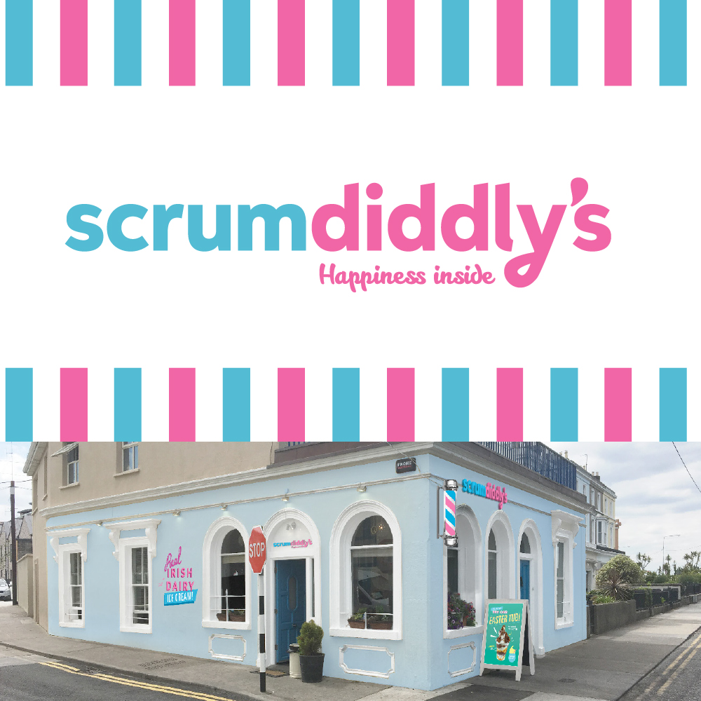
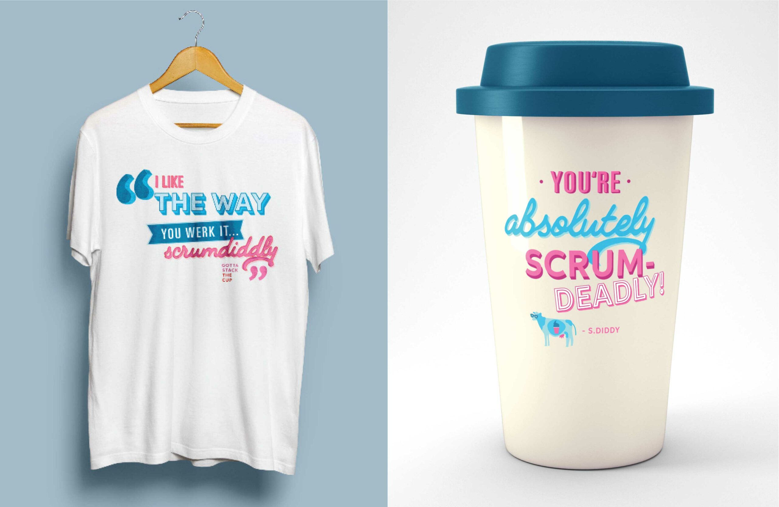
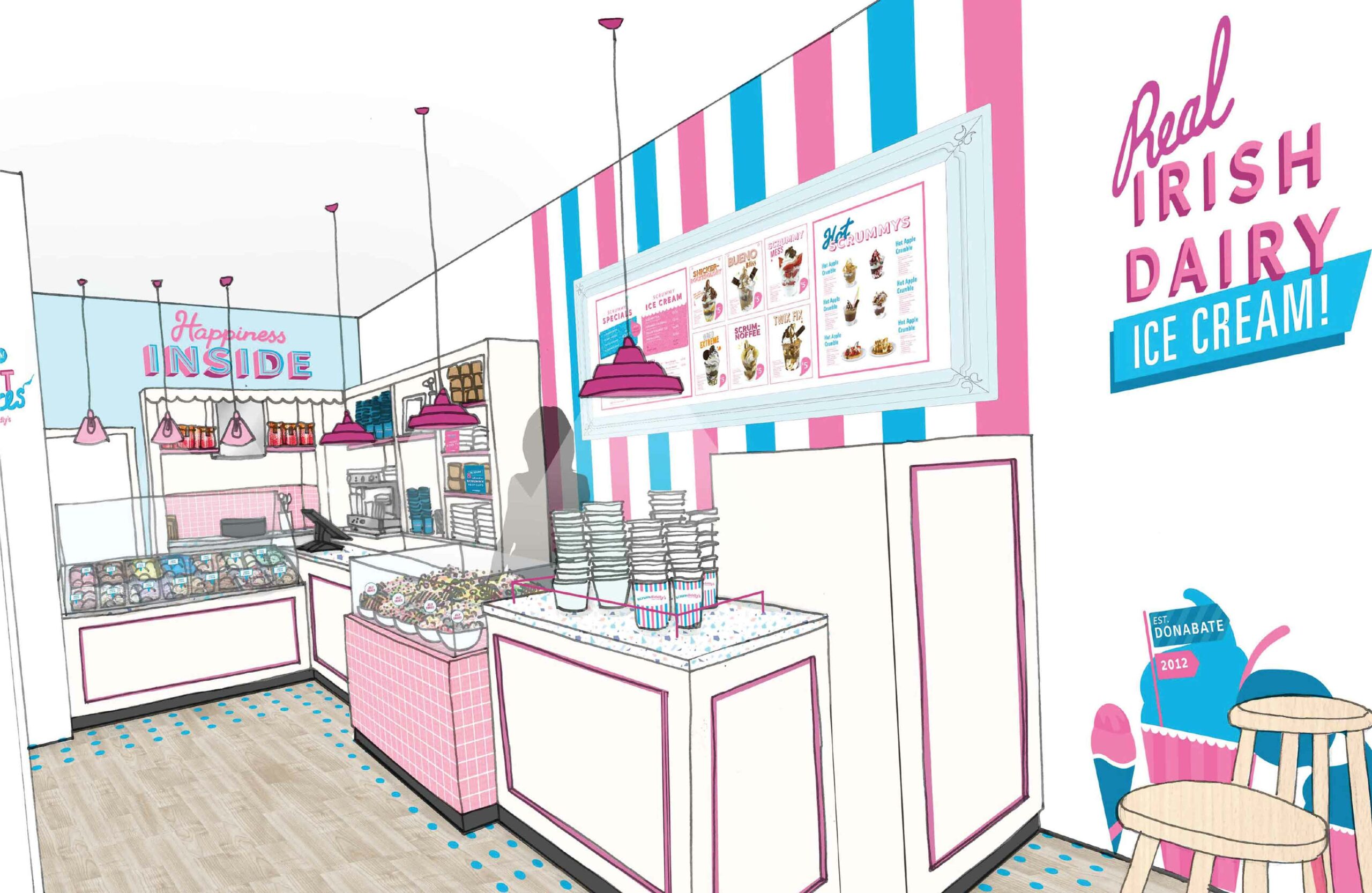
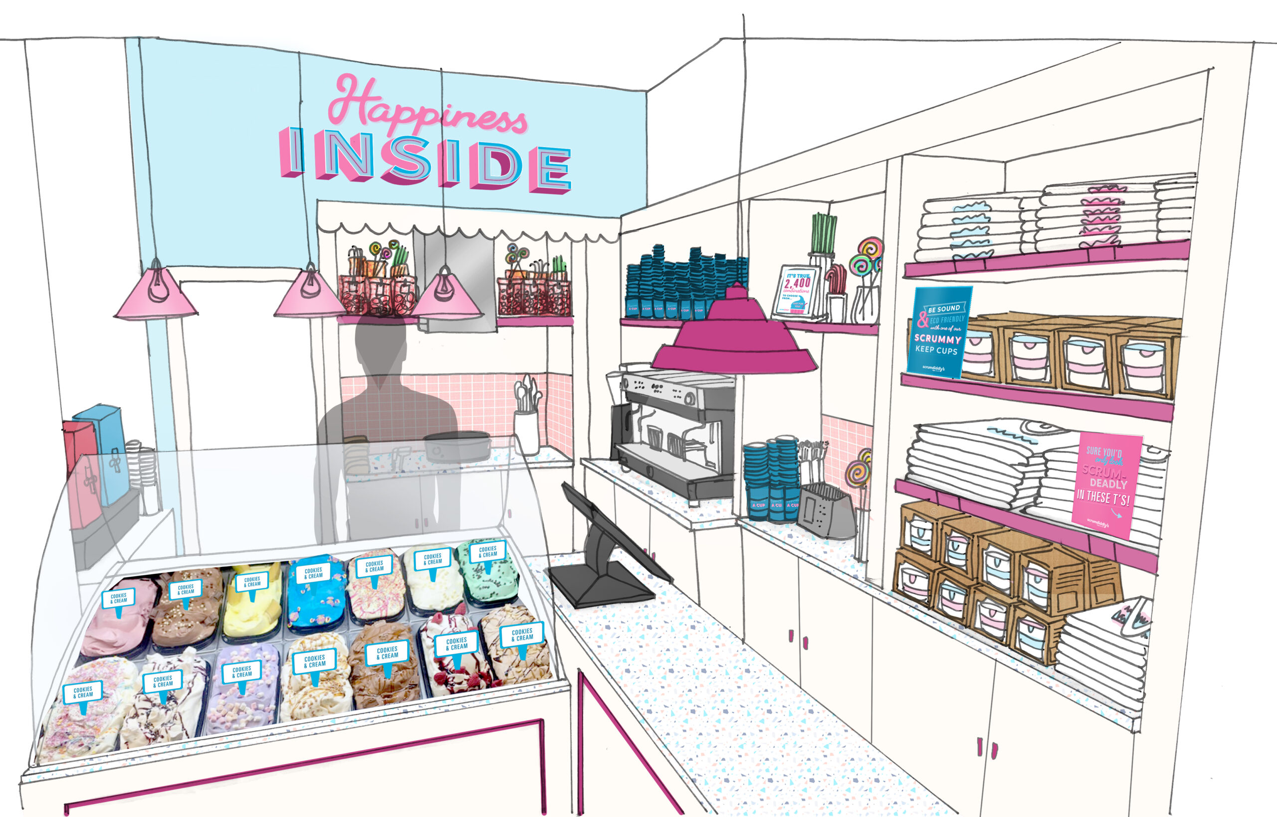
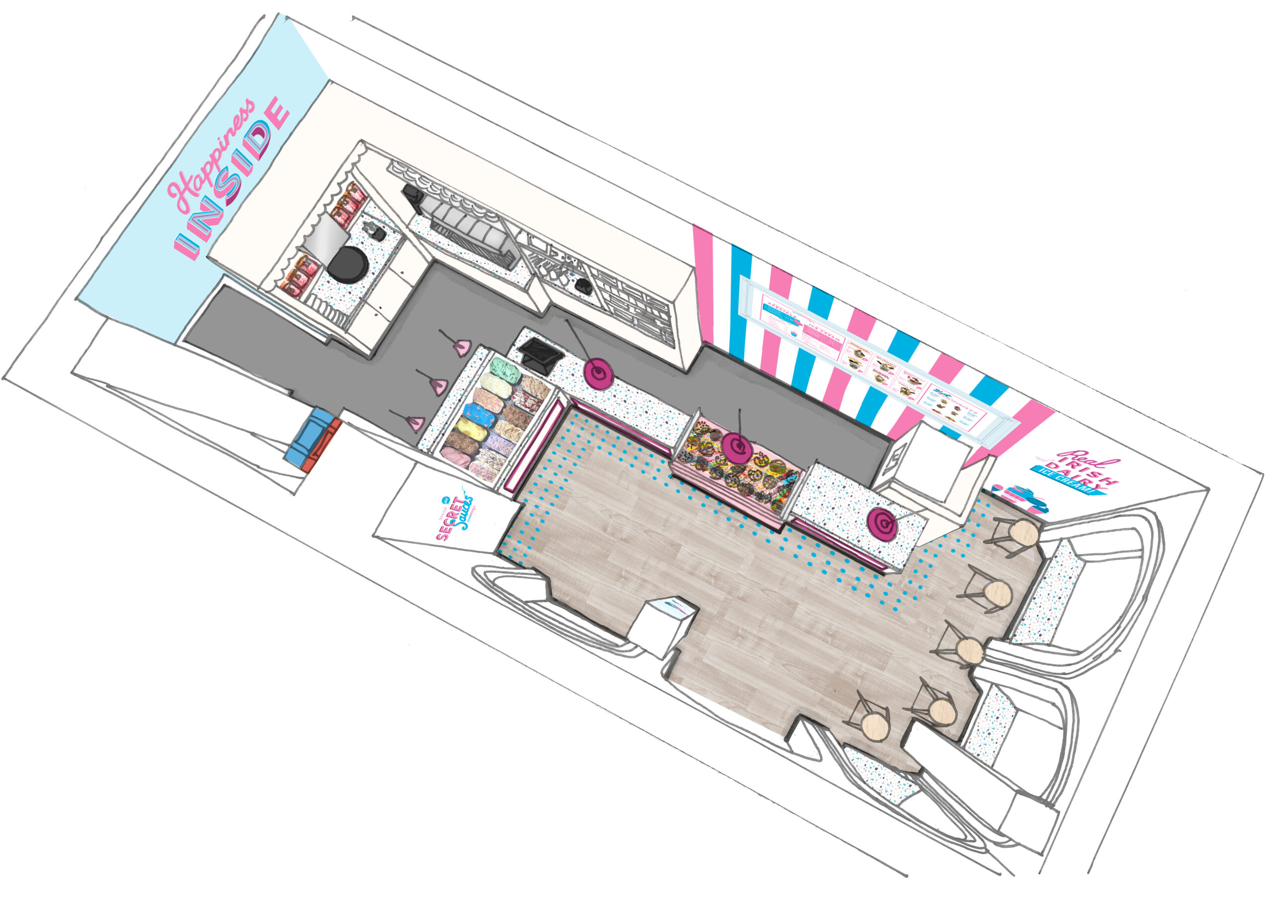
Not all design is conceived in shades of muted, seriously-minded tones – the brief is you go whichever way the wind is blowing. In the case of Scrumdiddly’s, TapCreative’s comprehensive design across the brand identity (which included store design, POS, packaging and merchandise) conjured up broad stripes of bright colours that directly reference the ice cream company’s tagline of ‘Happiness Inside’. The core themed colour design (pink, blue, mauve, red, white) also cleverly creates the carefree relationship between sunny days and seaside resorts, the thrill of rollercoasters and clamour of boneshakers, the light-heartedness of the funfair, and those moments of laugh-out-loud joy that velvety, cool ice cream brings.
Future achievements seem assured as Scrumdiddly’s looks towards establishing a franchise model across Ireland. The aim is to grow the brand as a year-round favourite that views ice cream not as a throwaway indulgence during warm/hot spells only but as a valued, healthy treat on any day you like. An extensive in-store (and online) allergens information chart is readily visible for ice cream, toppings, sauces and milkshakes.