Ireland’s leading forecourt retailer, Maxol, needed to evolve its ethos in the fast-growing market of convenience food service. Post-recession and in the face of increased competition, they needed to grow their ‘foodie’ appeal to connect with and win a new customer, including more affluent premium professionals, as well as existing loyal shoppers.
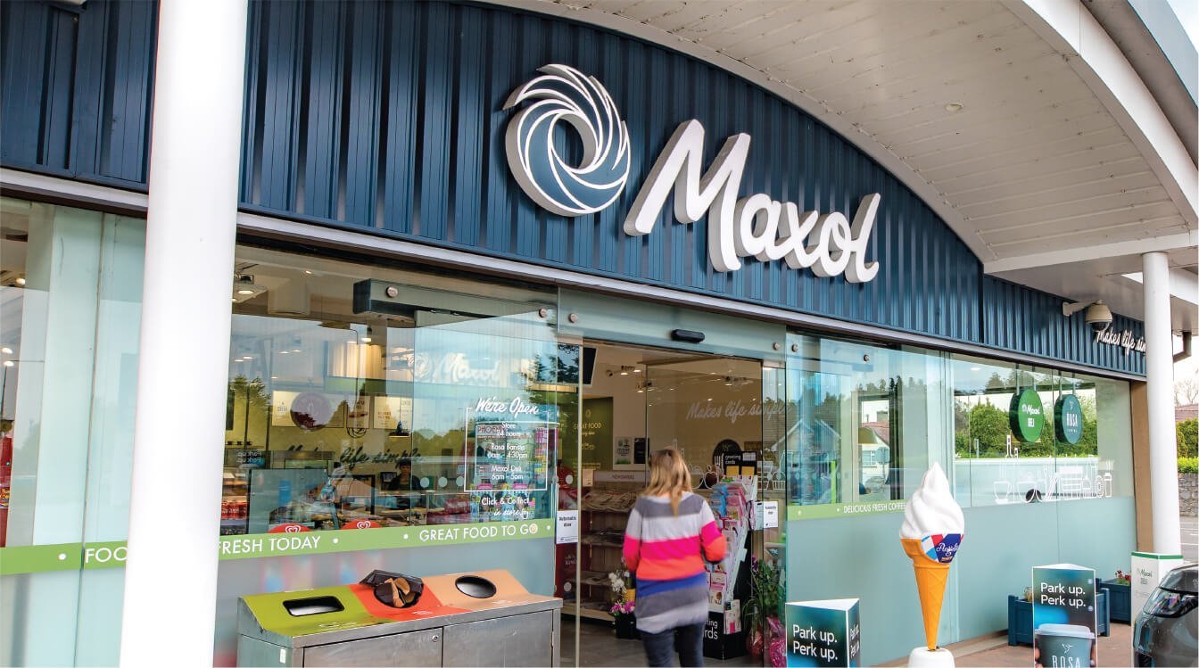
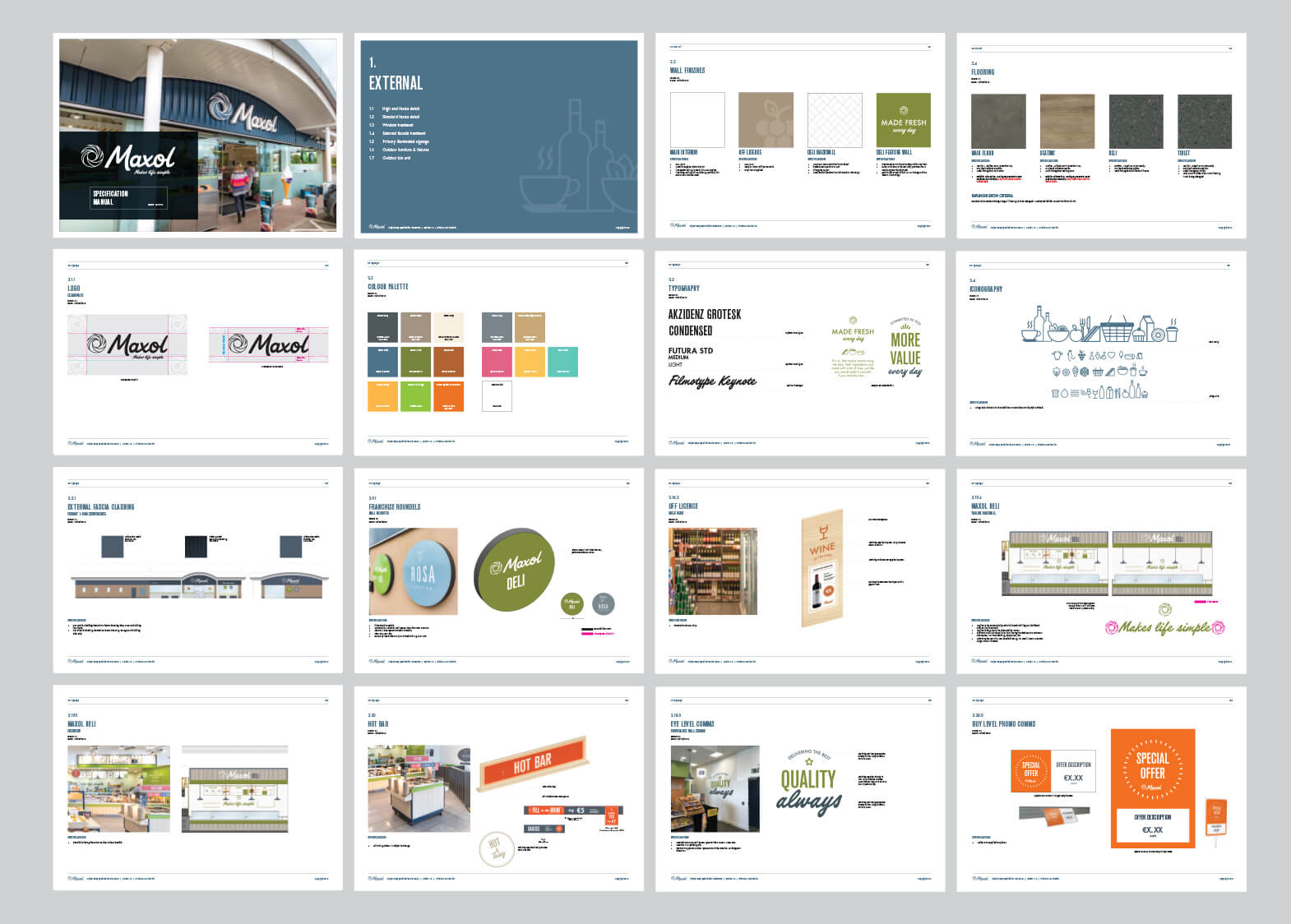
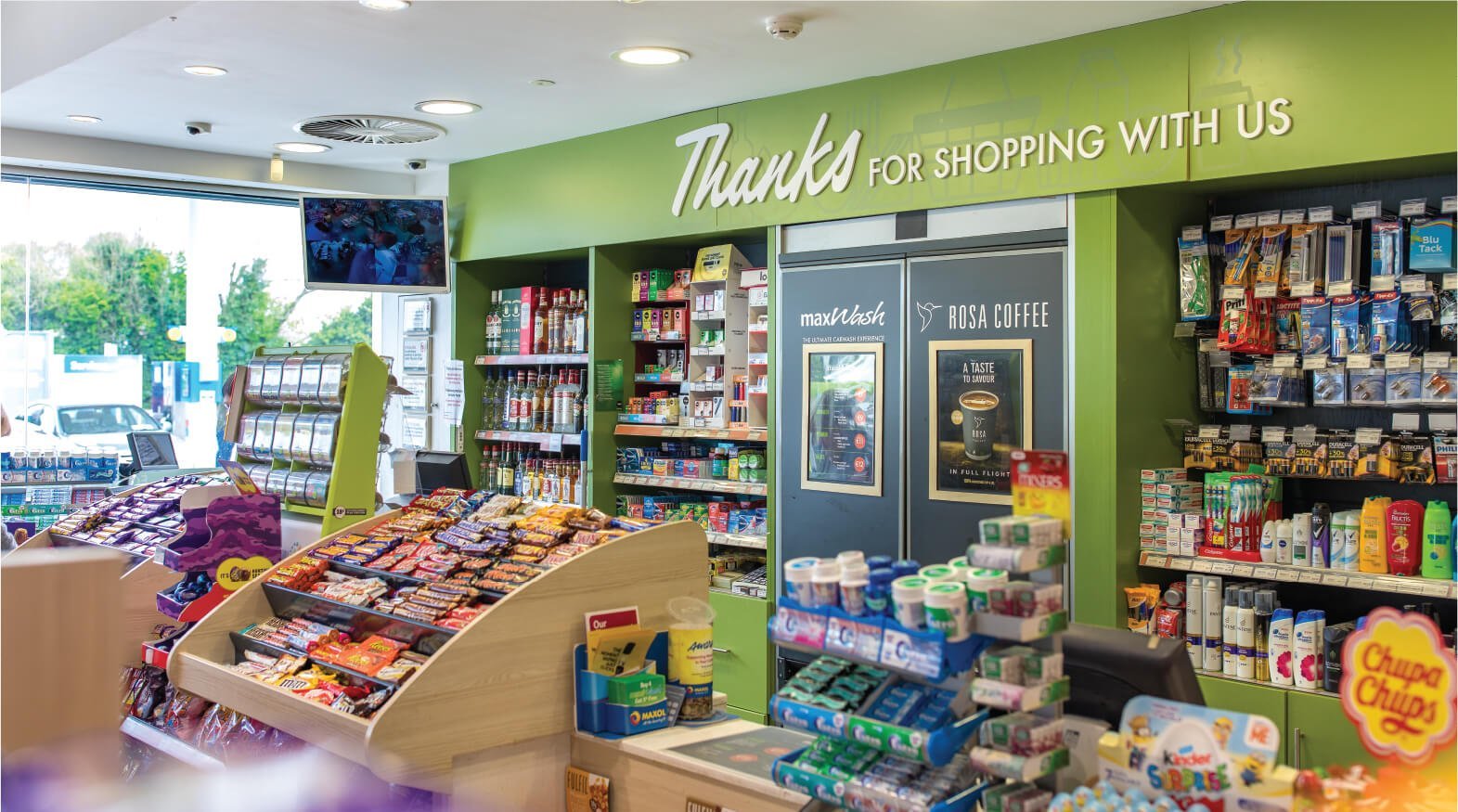
We transformed the visual language of the brand, shifting the focus from an expected forecourt shop with a ‘good enough’ food offer to a ‘go-to’ destination for great quality food, coffee and convenience. A new earthen colour palette speaks to the craft of their revitalised fresh food offer and premium quality whilst small bursts of high energy tones add a vibrancy to the warm environment of oak and steel cladding. With an intent to invigorate the brand aesthetic and dial up their authority in food and convenience, we designed a personality that’s warm and down to earth, just like Maxol. Communications are simple, direct but also bring a a touch of fun and conversation throughout the stores.
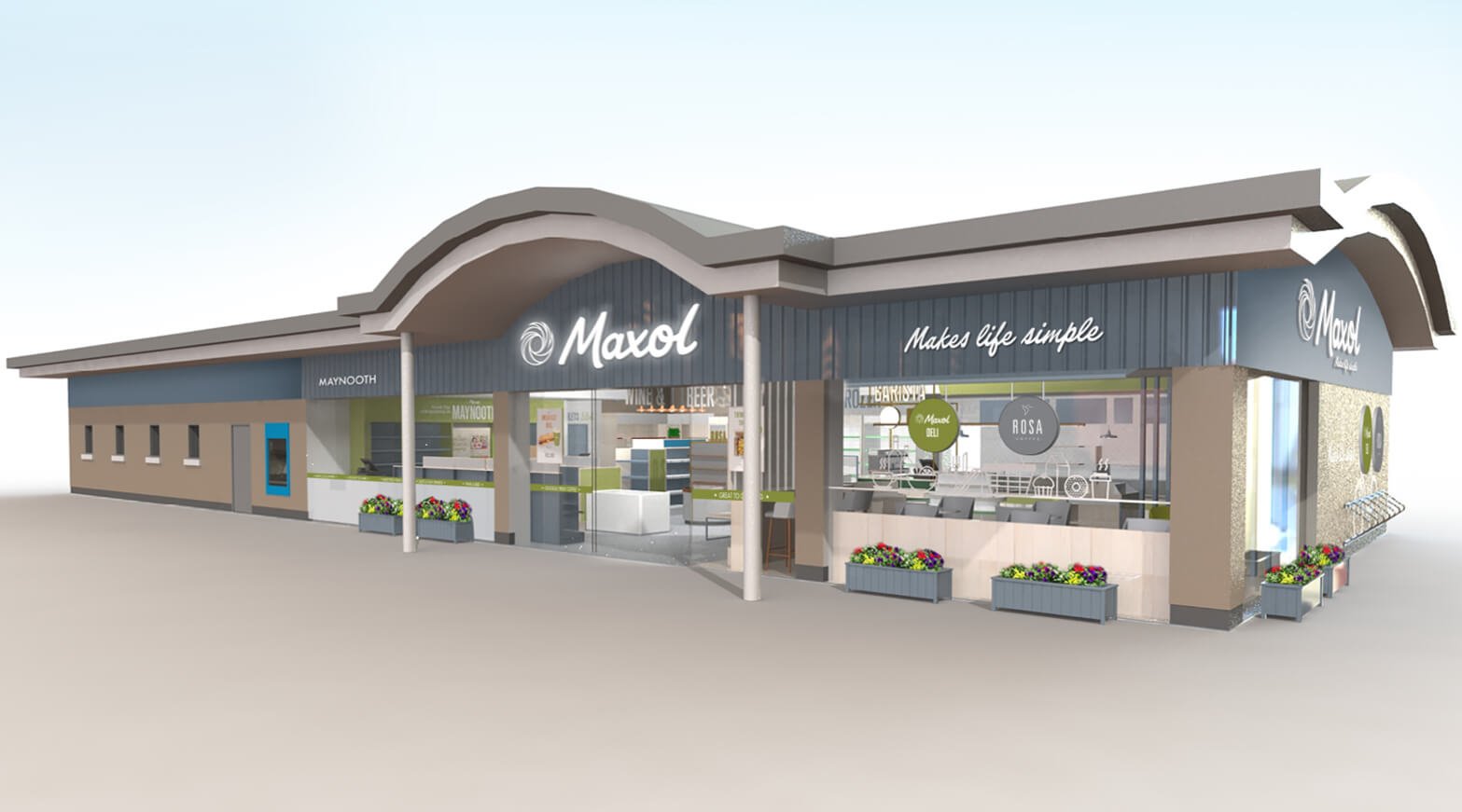
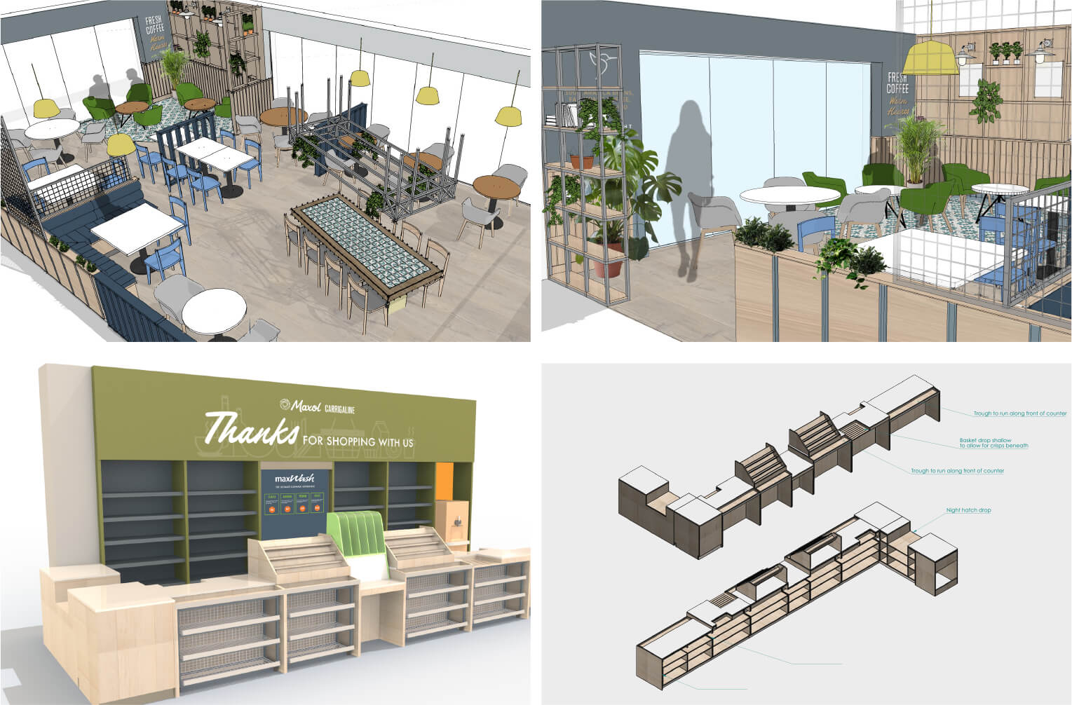
Our energetic and inviting new store design reintroduces Maxol as a modern food brand with a distinctive personality. It houses clear destinations, signature touchpoints and food ideas, underpinned by a logical journey flow.
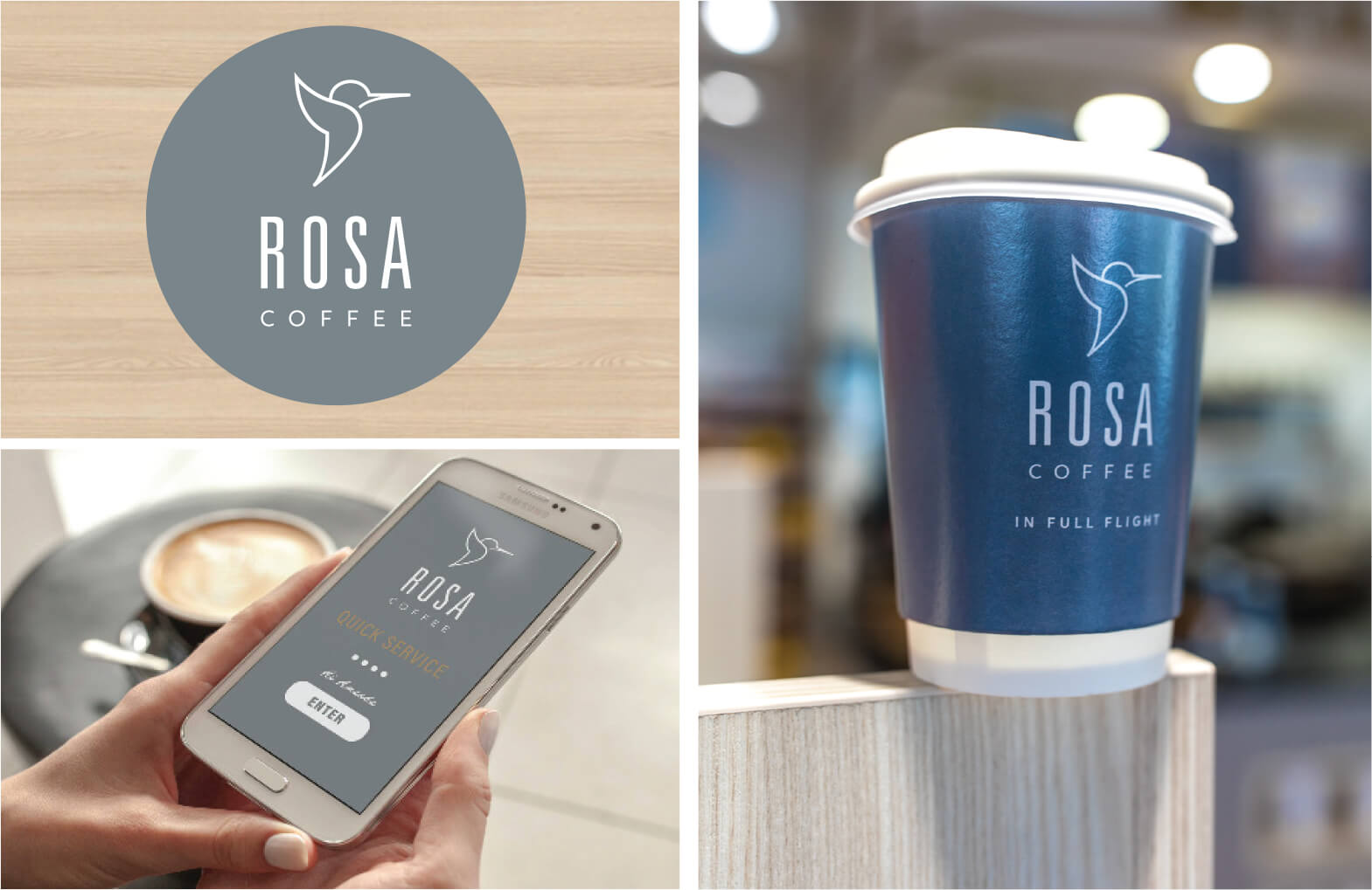
With a nationwide rollout successfully delivered, the platform has been established to herald in a new range of own-brands such as ROSA Coffee, that further increase the perception of quality for the brand and its foodie credentials – unprecedented before TapCreative’s refresh.
