Betsy’s Bakeshop was borne in the vision of owner Angela Aprile (aka Betsy) who - since childhood
- had dreamed about having her own store that celebrated her love of baking. Located in the heart of Clondalkin Village, the bakeshop offering of sweet treats, cupcakes, and cakes had built up a strong customer base thanks to the high quality of products and the flair of Betsy herself.
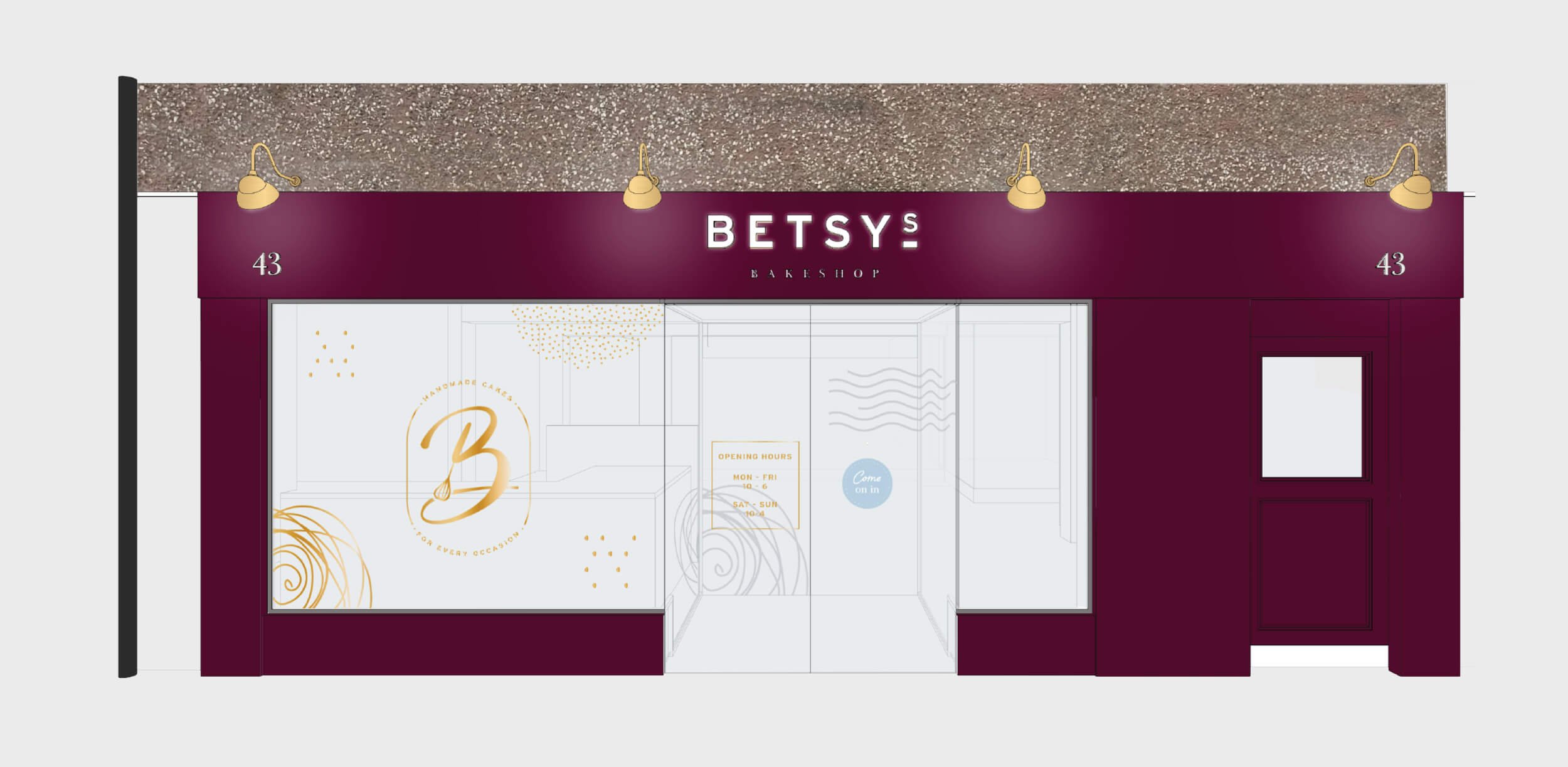
To robustly build on this reputation, TapCreative were engaged to design a wholescale overhaul of their customer experience. This involved the creation of a new brand identity, brand communications, graphics suite, and packaging alongside a full store design from concept through to implementation.
Our intent was to herald a new age for the brand, boosting the perception of quality to a wider audience and existing customers, whilst sharing Betsy’s passion for baking that’s at the heart of it all.
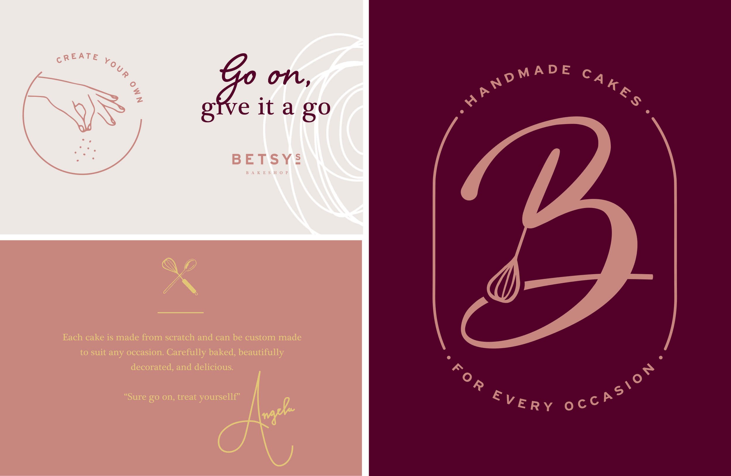
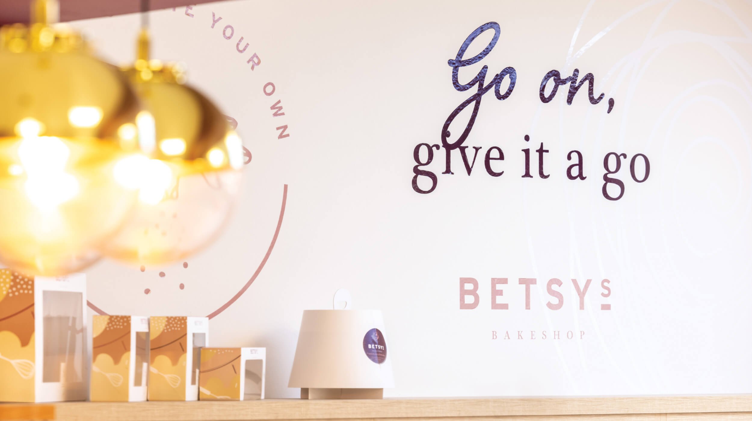
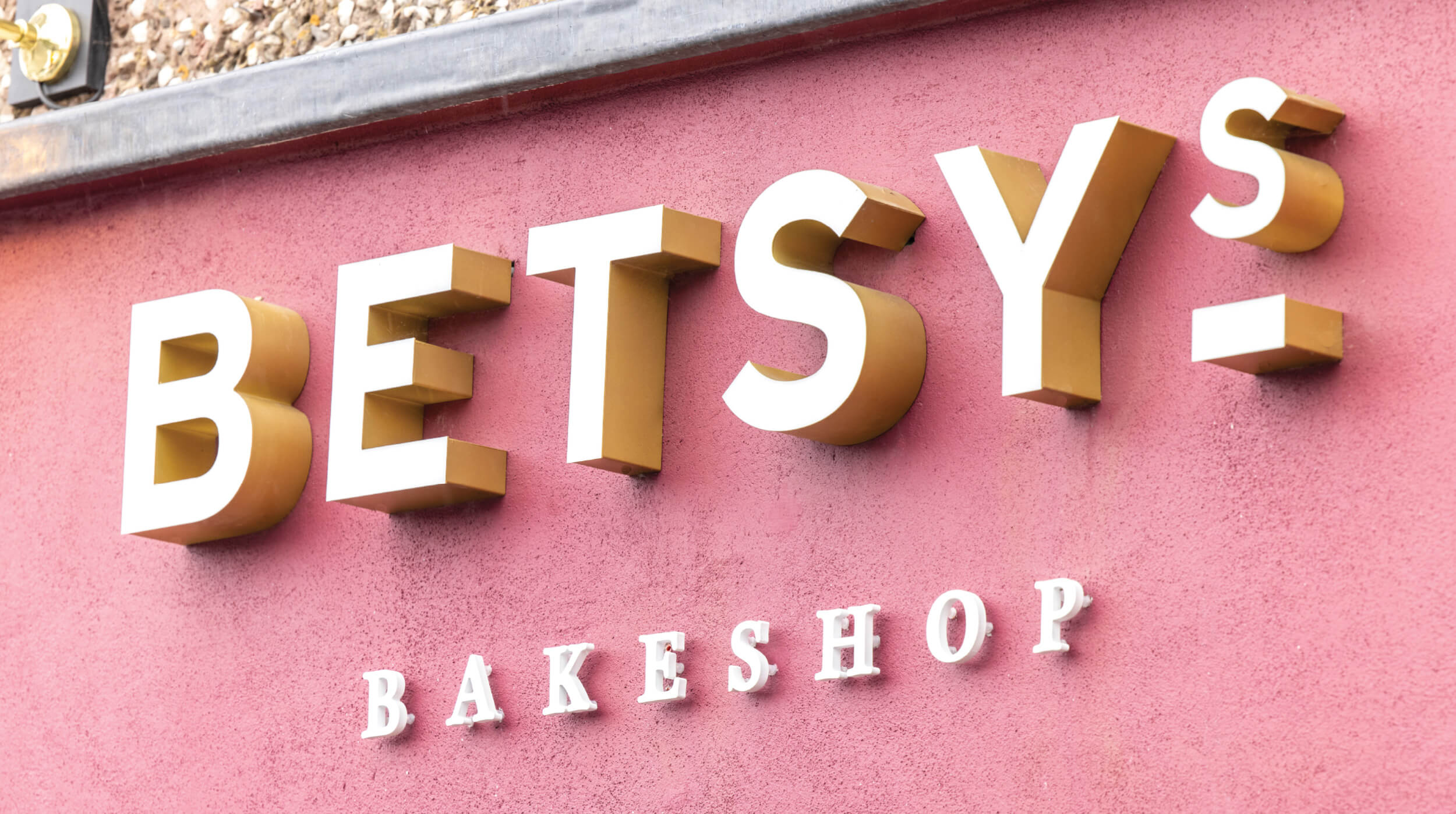
With a strong emphasis on community, our design approach was to dial up the brand’s authority as a high quality bakeshop, yet maintaining the upbeat and friendly personality of Betsy so that everyone feels welcome. This theme was subliminally reinforced at each touchpoint of the brand experience. It’s reflected in the design of the brand identity, fusing a minimalist and contemporary logotype with playful hand-drawn features, and through the balance of rich burgundy with lighter pastel tones in the colour palette.
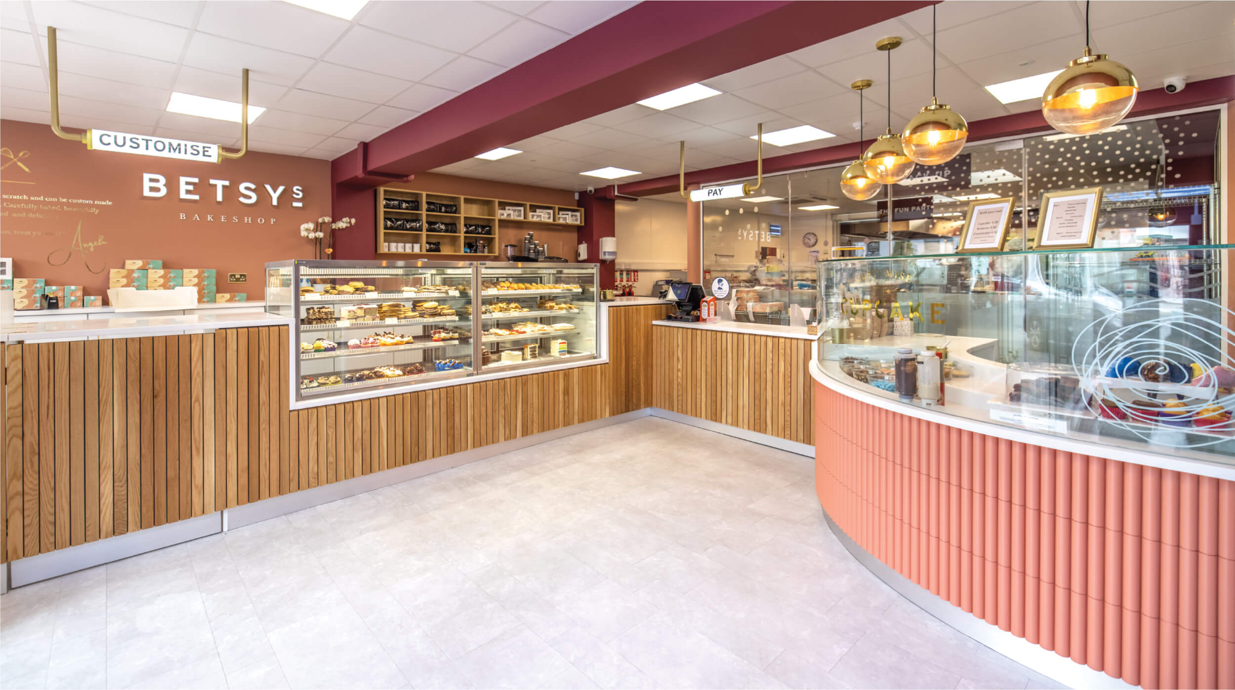
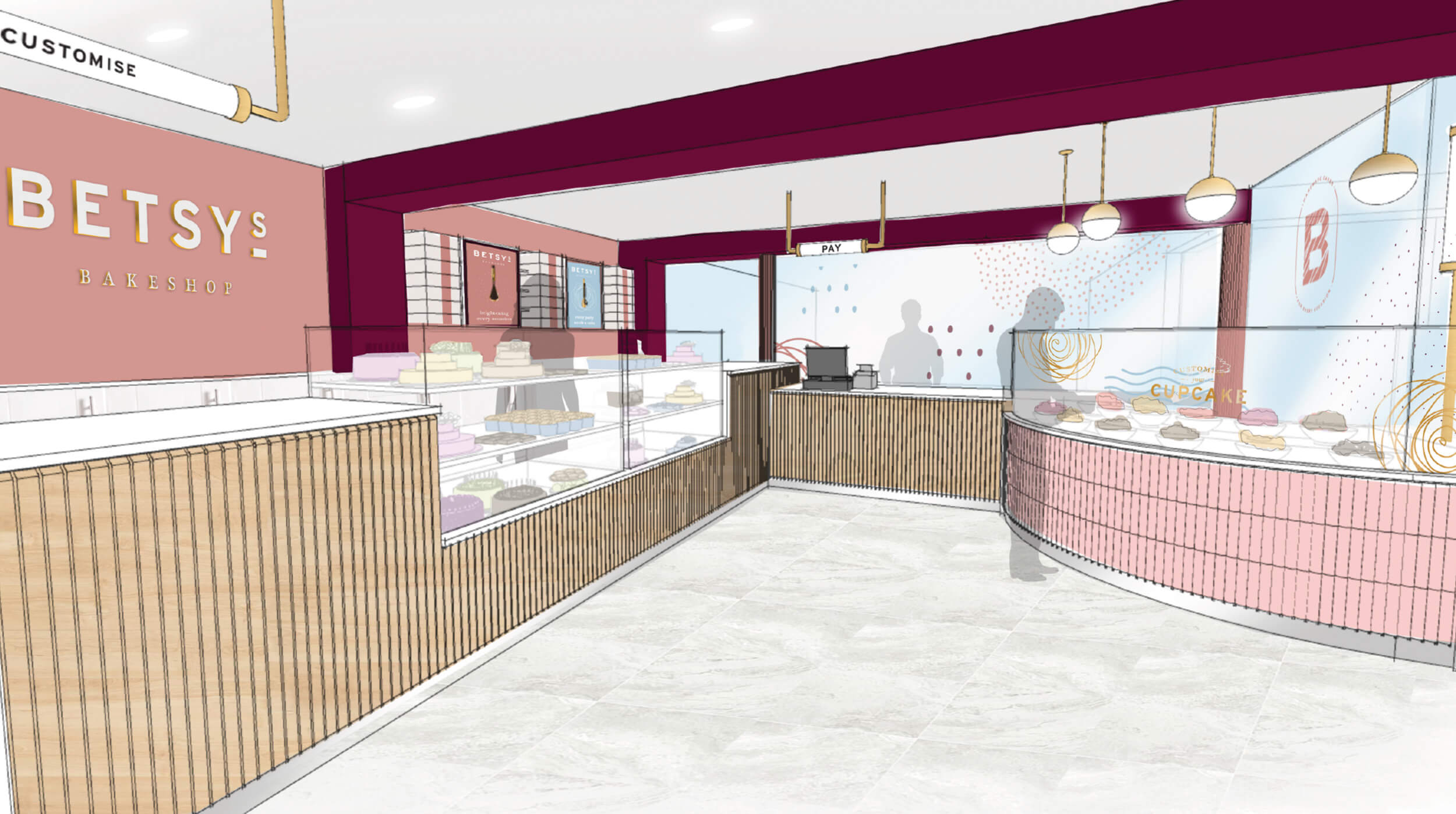
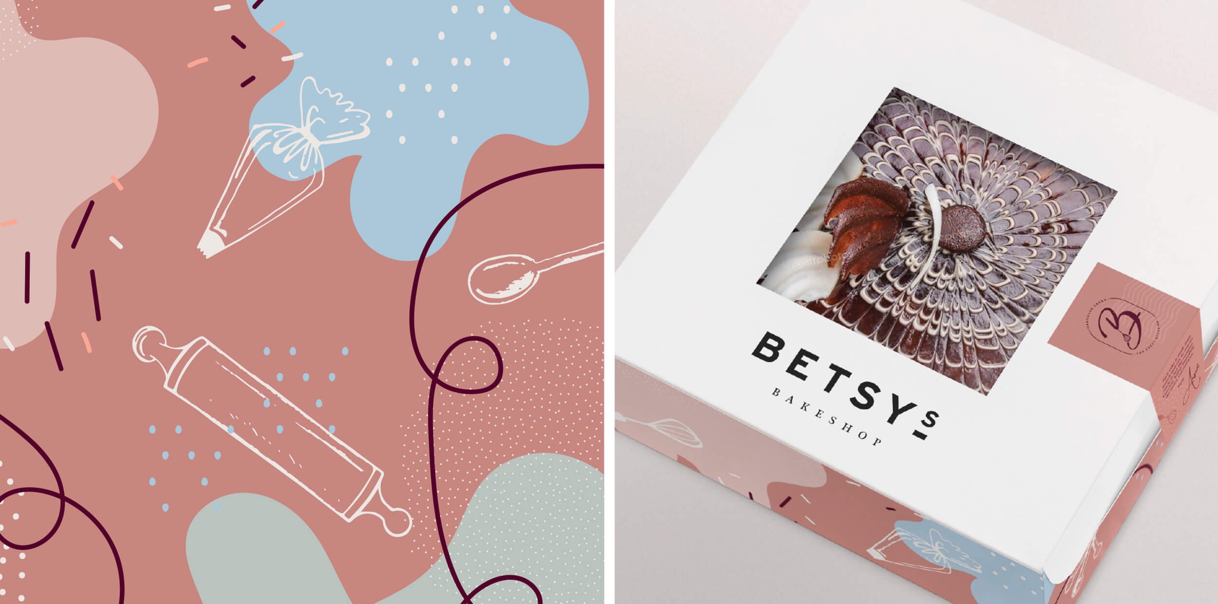
Betsy’s Bakeshop has charm in abundance and capturing that feeling informed every design decision we made. Hand drawn illustrations and motifs create a sense playfulness and warmth in the environment, further lending to the principles of every product being handmade, on site, everyday.
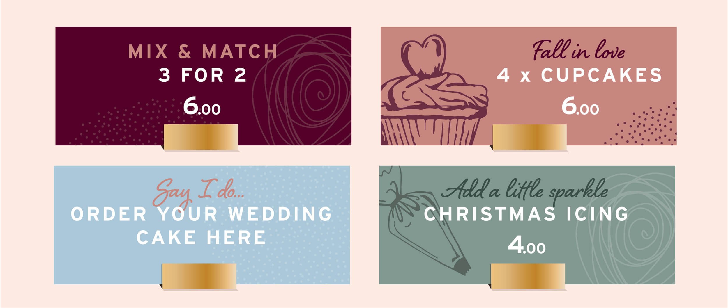
The tone of voice throughout the communications is purposefully conversational and light-hearted, just like the people who work there. Eye level signage effectively zones key areas such as the ‘Create your own cupcakes’ or ‘Customise’ - for ease of navigation in a post pandemic era - with buy level signage such as product ticketing simply informing customers of offers that are seasonally relevant and appealing.
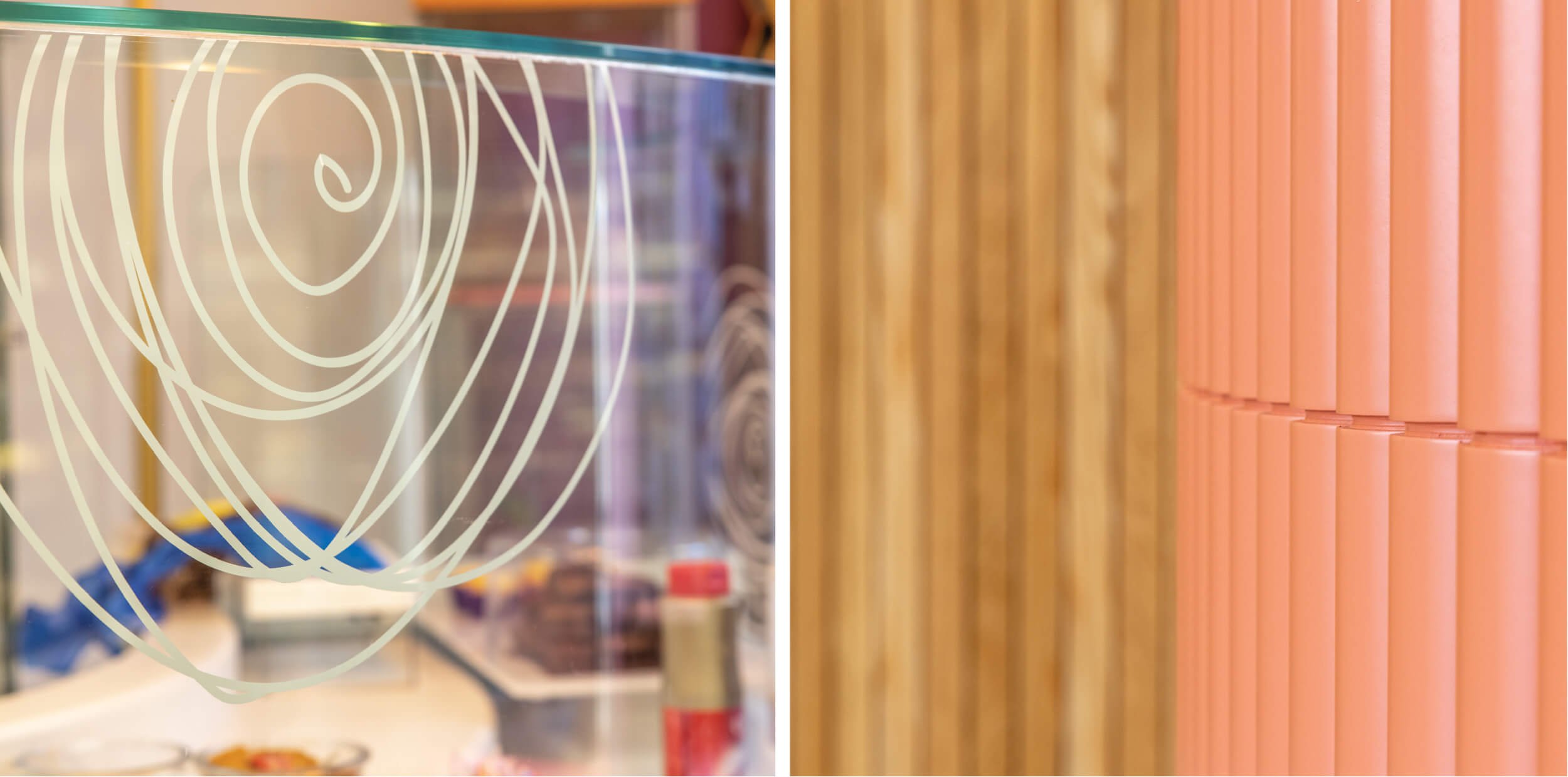
The design language of the brand flows through the physical space. We created a lively environment that is underpinned by the harmonious union of premium touches and grounded simplicity. Metallic accents partner with light oak and the warm colour palette. Considered fixture details - like the painted panelling on the cupcake counter reflecting the frills of an actual cupcake case - are further subliminal nods to the joy of baking.
Lively patterns and illustrative motifs on the packaging emphasises the identity’s playfulness. It has led to the revaluation of an own brand range such as DIY kits that bring the brand experience into the customer home.
As a bakeshop, our aim was to excite and delight customers beyond their expectations, convey a sense of relaxation as a respite from busy lifestyles, and meaningfully connect with people through the simple joy that comes from small moments of indulgence. All wrapped up with the charisma of Betsy.